Color is weird. Seriously. If you’ve ever tried to pick a single "flesh" tone in Photoshop, you know exactly how quickly things go south. One minute you think you’ve found a nice tan, and the next, your character looks like a radioactive sweet potato. Or maybe a corpse. There is no such thing as a single skin tone hex code that works for everyone because human skin isn't a solid matte finish. It’s a translucent, layered mess of blood vessels, melanin, and light scattering.
Getting it right matters. Whether you are building an inclusive avatar creator for a gaming app or just trying to make a UI illustration look less "uncanny valley," you have to understand the math behind the pigment.
Why Your Skin Tone Hex Code Looks "Off"
Most beginners make the mistake of staying in the middle of the color picker. They go for a muted peach or a flat brown. But real skin has a high amount of saturation in the mid-tones. If you look at the work of legendary painters like John Singer Sargent, he didn't just use "skin color." He used greens, blues, and deep reds. In the digital world, we translate this through the hexadecimal system.
A hex code like #FFE0BD might look okay in a tiny swatch, but apply it to a large surface and it feels lifeless. Why? Because it lacks the "undertone." Skin is categorized by three main undertones: cool (pink, red, or bluish), warm (yellow, peachy, golden), and neutral (a mix of both).
If you are designing for a global audience, you can’t just shift the brightness slider up and down. A dark skin tone isn't just a "darker version" of a light skin tone. The hues actually shift. Darker skin tones often lean more toward the red and purple spectrum in the shadows, while lighter tones can lean more yellow or pink depending on blood flow.
The Fitzpatrick Scale and Digital Translation
In 1975, Thomas B. Fitzpatrick, a dermatologist at Harvard, created a scale to help predict how different skin types react to UV light. It’s become a bit of a gold standard for designers too. It breaks skin into six types.
Type I is very pale, always burns, never tans. Think of a hex like #F9EBE0. By the time you get to Type VI, which is deeply pigmented skin that rarely burns, you’re looking at something closer to #3C2E28 or #2D221E.
But here is the kicker: you can’t just use these as "bucket fill" colors. You need a palette.
Creating a Realistic Palette (Beyond the Single Code)
Let's get practical. If you’re building a UI or an illustration, you need a ramp. A ramp is a series of colors that transition naturally.
For Light Skin Tones:
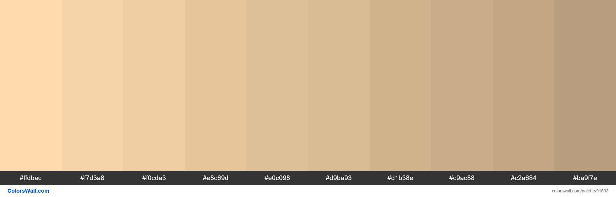
Don’t just use white. Start with a base like #FFDBAC. For your shadows, don’t add black—add a bit of terra cotta or a desaturated purple like #D1A3A4. It sounds crazy, but it works. The blood under the skin makes shadows look warmer, not just darker.
For Medium/Olive Tones:
This is where people struggle the most. Olive skin often has a green or yellow undertone. A base like #E0AC69 works well, but you need to be careful not to make it look jaundiced. Balance it with some richer browns like #8D5524 in the recessed areas of the face or body.
For Deep Skin Tones:
Melanin has a beautiful way of reflecting light. Deep skin tones, like #3B2219, often have incredible highlights that lean toward cool blues or sharp magentas because of the way oils on the skin catch the light. If you only use brown and dark brown, the design will look "muddy." Use a hex like #503335 for your mid-tones to keep that warmth alive.
The Technical Side of Accessibility
If you’re a developer, you’ve probably heard of the Monk Skin Tone (MST) Scale. This was a big deal. Google collaborated with Dr. Ellis Monk, a sociology professor at Harvard, to release a 10-shade scale specifically designed to be more inclusive than the old 6-point Fitzpatrick scale.
The tech industry realized that AI and camera sensors were failing people with darker skin because the "standard" hex codes used in training data were too narrow. By using a broader spectrum—ranging from #F6EDE4 at the lightest to #292420 at the darkest—software can better recognize faces and adjust exposure settings.
Honestly, if you are coding a dropdown for "Select your skin tone," don't just use 5 circles. Use at least 10, and make sure they cover the nuances of those reddish and yellowish shifts.
Lighting Changes Everything
A hex code is a static value. In a vacuum, #FFDBAC is just a color. But in a design, it’s affected by its surroundings. This is called simultaneous contrast.
If you put a medium skin tone hex next to a bright neon green background, the skin is going to look sickly and red. If you put it against a dark navy, it’s going to pop and look much brighter than it actually is.
When you’re picking your skin tone hex code, you have to test it against your UI's background.
- For Dark Mode: Use slightly more saturated skin tones so they don't look "greyed out."
- For Light Mode: Be careful with very pale hex codes; they might disappear into the white space.
Common Hex Ranges to Bookmark
If you just need a quick starting point, here are some ranges that actually look human:
- Fair/Pale: #FFF5E1, #FFDBAC, #F1C27D
- Medium/Tan: #E0AC69, #C68642, #B58150
- Deep/Dark: #8D5524, #5C3836, #2D221E
Don't treat these as gospel. They are baselines. You'll likely need to tweak the hue (H) in your HSL settings by a few degrees one way or the other to get it to "feel" right for your specific project.
Avoid the "Plastic" Look
The biggest giveaway of amateur digital art or UI is the lack of variation. Even on a single hand, the palm is a different hex code than the back of the hand. The knuckles are often redder (#A3514E). The veins might show through as a faint blue-green (#7B9086).
If you're working in Figma or Adobe XD, use gradients or low-opacity overlays to blend these colors. A solid #F1C27D shape is a cartoon. A #F1C27D shape with a 10% opacity soft red glow on the edges? That’s a person.
Actionable Steps for Your Next Project
Stop guessing. Start measuring.
First, grab a high-quality, unedited photograph of a person in natural lighting. Use the eyedropper tool, but don't just click once. Click the forehead (highlight), the cheek (mid-tone), and the jawline (shadow). You will see that the "color" of that person is actually a spectrum of at least five or six different hex codes.
Second, check your contrast ratios. If you are placing text over a skin-toned graphic, use a tool like WebAIM to ensure it’s readable. Inclusive design isn't just about the color of the skin; it’s about making sure the interface works for everyone regardless of their visual acuity.
Lastly, build a library. Instead of hunting for a new skin tone hex code every time you start a new wireframe, create a "Human Palette" in your design system. Include at least two variations for each of the 10 Monk Scale points—one for "warm" lighting and one for "cool" lighting. This saves you hours of fiddling with sliders and ensures your brand looks consistent across different illustrations.
Realism in design isn't about perfection. It’s about acknowledging the complexity of the human form. Use these codes as a foundation, but let your eyes be the final judge. If it looks like a doll, add more red. If it looks like a zombie, add more yellow. Keep tweaking until it breathes.