Picking a paint color is stressful. Honestly, it’s the kind of decision that makes you stare at a tiny paper swatch for three days until you lose your mind. But if you’ve been scrolling through Instagram or Pinterest lately looking for that perfect "not-quite-green, not-quite-gray" vibe, you’ve probably stumbled across Sherwin Williams Retreat. It’s everywhere.
Designers love it. Homeowners are obsessed with it. But why?
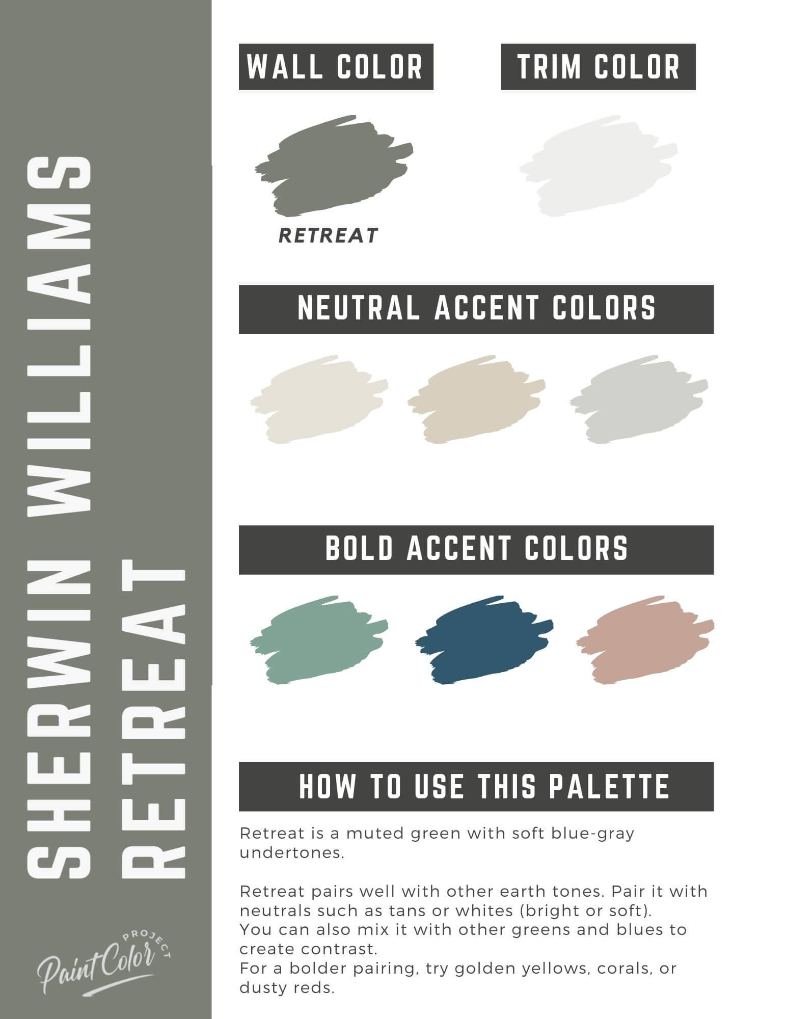
It’s not just another sage green. Retreat (SW 6207) is a complex, moody, and surprisingly versatile shade that sits in that sweet spot between organic and sophisticated. It’s got a bit of a secret identity. In some lights, it looks like a deep, misty forest. In others, it settles into a calm, slate-like gray. It's basically the interior design equivalent of a cozy wool blanket on a rainy afternoon.
If you're tired of the "millennial gray" era and want something with actual soul, this might be your winner.
The Technical Bits: LRV and Undertones
Let’s talk numbers for a second, but I’ll keep it quick. The Light Reflectance Value (LRV) of Sherwin Williams Retreat is 21. For context, 0 is absolute black and 100 is pure white.
A 21 means it’s a medium-to-dark tone. It’s got weight. It’s not going to make a tiny, windowless bathroom feel "airy," but it will make it feel like a high-end spa.
The undertones are where people get tripped up. Retreat is part of the Green Color Family, specifically the "Cool Green" neighborhood. It’s heavily infused with gray, which keeps it from looking like a bright lime or a primary school classroom. There’s also a tiny, almost imperceptible hint of blue in the base. This blue-gray-green mix is what gives it that "muddy" quality—and in the paint world, "muddy" is a compliment. It means the color has depth and won't look neon when the sun hits it.
Where Sherwin Williams Retreat Actually Works (and Where It Doesn't)
I’ve seen people put this in every room of the house, but it definitely has its favorite spots. Kitchen cabinets are a huge one right now. If you’re over the all-white kitchen trend but aren't brave enough for navy blue or black, Retreat is a fantastic middle ground. It looks incredible with unlacquered brass hardware or natural white oak shelving.
Bedrooms? Yes. Absolutely. It’s literally named "Retreat." It creates this cocoon-like effect that’s perfect for sleeping.
However, you’ve gotta be careful with lighting.
If you have a north-facing room with that weak, cool blue light, Retreat is going to lean hard into its gray side. It might even feel a little chilly. On the flip side, in a south-facing room with tons of warm afternoon sun, the green really pops. You’ll see that earthy, mossy side come to life.
Pro Tip: Always, always paint a large sample board and move it around the room at different times of day. Don't just trust the screen.
The Exterior Factor
Surprisingly, this is a killer choice for home exteriors. Because it’s a darker hue, it doesn't wash out in direct sunlight the way lighter greens do. Use it on a front door for a sophisticated "English cottage" look, or use it on the siding paired with a crisp white trim like SW Extra White. It looks particularly sharp against red brick or natural stone.
Comparing the "Green-Gray" Contenders
You’re probably looking at a few different colors right now. Let’s see how they stack up against the heavy hitters.
Retreat vs. Sea Salt
Sea Salt (SW 6204) is the much younger, lighter sibling. It has an LRV of 63, making it significantly brighter. While they share similar DNA, Sea Salt is "beachy" and airy, while Retreat is "forest-y" and grounded. If Sea Salt is a morning at the coast, Retreat is a cabin in the woods.
Retreat vs. Pewter Green
Pewter Green (SW 6208) is just one step darker on the same color strip. It’s moodier, more intense, and feels more "formal." If you think Retreat is a bit too light for your accent wall, Pewter Green is your next stop.
Retreat vs. Saybrook Sage
Benjamin Moore’s Saybrook Sage is a classic, but it’s much "greener" and warmer. It doesn't have that heavy gray overcast that makes Sherwin Williams Retreat feel so modern. Saybrook Sage is more traditional; Retreat is more contemporary.
Real World Pairing: What Goes With It?
Don't pair this with a muddy, cream-yellow white unless you want your house to look like it's stuck in 1994. You need something clean.
Whites and Off-Whites:
- SW High Reflective White: For a sharp, modern contrast.
- SW Alabaster: If you want it to feel softer and more lived-in. Alabaster is warm but not yellowy.
Wood Tones:
This color loves wood. Specifically, light to medium tones. Think white oak, birch, or even a walnut. Avoid super red mahoganies—the red and green will fight for attention, and it can start looking like a Christmas card real fast.
Metals:
Satin brass or "champagne bronze" is the gold standard here. The warmth of the gold cuts through the coolness of the paint. If you prefer silver, go with a polished nickel rather than a cold chrome.
The "One Room" Strategy
If you’re scared of committing to a full room, try it on a focal point. A fireplace mantel painted in Retreat against a neutral wall is a vibe. A laundry room—usually the most boring room in the house—can become a tiny design masterpiece with Retreat cabinets and some fun floor tile.
It’s a "safe" bold color. It’s dramatic enough to be noticed, but natural enough that it won't give you a headache after six months.
People often ask if it's too dark for small spaces. Honestly, no. Small rooms can actually handle dark colors quite well; they just embrace the smallness and make it feel intentional rather than cramped. It's about creating an atmosphere.
Practical Steps for Your Project
- Get a Peel-and-Stick Sample: Use a brand like Samplize. It’s better than buying a $10 pot of paint you’ll eventually throw away, and you can move the sticker from wall to wall.
- Check Your Flooring: If you have very orange-toned oak floors, the green in Retreat will actually highlight that orange (complementary colors on the wheel). Make sure you like that combo before you buy five gallons.
- Choose the Right Sheen: For walls, go with an eggshell or "flat enamel." It hides imperfections. For cabinets or trim, a semi-gloss or satin will make the color look richer and easier to clean.
- Evaluate Your Lighting: If you use "soft white" bulbs (2700K), the room will look very green. If you use "daylight" bulbs (5000K), it will look more gray/blue. Aim for a "cool white" or "neutral" (3000K-3500K) for the most accurate color representation.
- Commit to the Second Coat: This color can look a little "patchy" on the first coat because of the heavy pigments. Don't panic. The second coat is where the magic happens and the depth truly reveals itself.
Sherwin Williams Retreat isn't a passing fad; it’s part of a larger shift back toward nature-inspired, grounding colors. It’s for the person who wants their home to feel like a sanctuary, away from the noise of the outside world. It’s sophisticated, it’s earthy, and it’s remarkably hard to mess up if you get the lighting right.
Start by testing a sample on your most poorly lit wall first. If you still love it there, you'll love it anywhere.