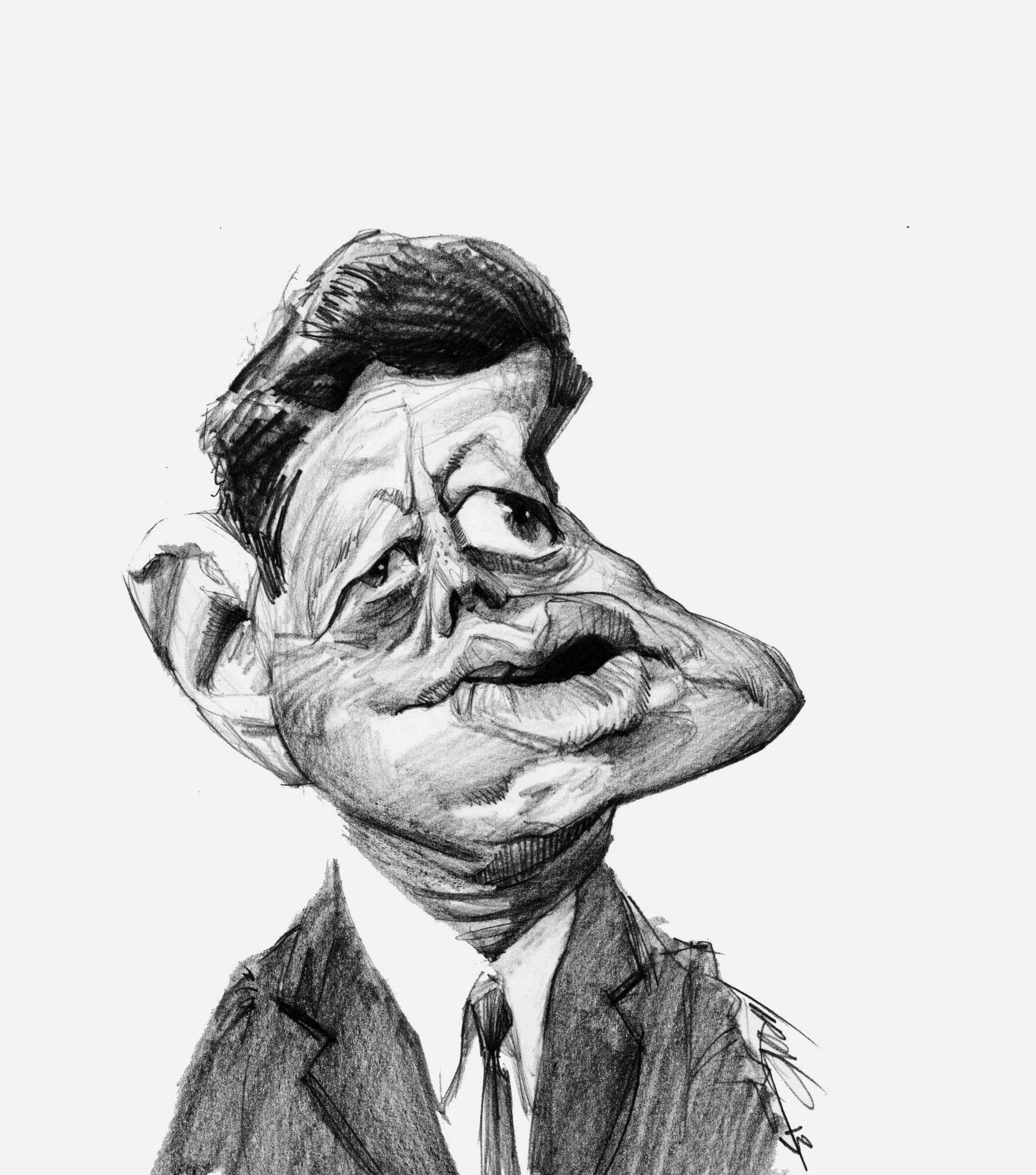
Capturing the essence of Camelot isn't as easy as just tracing a jawline. If you've ever tried your hand at a drawing of John F Kennedy, you know exactly what I mean. There is something famously elusive about his face. It’s the eyes, mostly. They weren't just blue; they held this weird, vibrating mix of intense pain from his chronic back issues and a sort of "I know something you don't" charisma.
Artists have been obsessed with him for decades. From the hasty charcoal sketches done by courtroom artists to the meticulously layered oil paintings that hang in the National Portrait Gallery, everyone is trying to find the "real" Jack. But here’s the thing: most people get it wrong. They lean too hard into the tan and the hair, forgetting the tension that sat right under his skin.
He was arguably the first "televised" president. Because of that, we have millions of frames of reference. Yet, a truly great drawing of John F Kennedy has to do more than just mimic a photograph. It has to capture the weight of the Cold War and the breezy optimism of the early sixties all at once. It's a tall order for a piece of paper and some graphite.
The Problem with the "Standard" JFK Look
Most amateur sketches fall into the same trap. They draw the hair—that thick, iconic "mop" that helped win him the 1960 debate against a sweaty Nixon—and they think they're done. But Kennedy's face changed radically depending on his health. On his good days, he looked like a movie star. On his bad days, the steroid treatments for Addison’s disease made his face puffier, a detail often omitted by artists who want to preserve the myth.
If you are looking at a drawing of John F Kennedy and he looks like a generic 1950s catalog model, it’s a failure. Real artists, the ones who really got him, understood the asymmetrical nature of his features. One eyelid often drooped slightly lower than the other. His smile was rarely perfectly centered.
Jamie Wyeth and the Portrait That Scared People
You can't talk about Kennedy art without mentioning Jamie Wyeth. In 1967, the Kennedy family commissioned him to do a posthumous portrait. Jamie didn't just look at photos. He spent months watching Jackie and the brothers, Robert and Ted, trying to soak up their mannerisms to find the ghost of Jack.
The result? Honestly, it kind of freaked people out.
Instead of the smiling, heroic figure the public wanted, Wyeth drew a man who looked worried. One eye is squinting, his hand is pressed against his chin, and he looks like he’s staring directly into a crisis. It’s arguably the most famous drawing of John F Kennedy because it felt too real. It stripped away the "President" and showed the "Man." Robert Kennedy reportedly said it looked just like Jack before the Bay of Pigs. That is the power of a sketch over a photo. It interprets the soul.
Why Technical Accuracy Isn't Enough
Let's get into the weeds for a second. If you’re a sketch artist or just a fan of political art, you’ve probably noticed that Kennedy’s bone structure is a nightmare to get right. He had high cheekbones, but they were often masked by his "healthy" glow.
- Use a soft lead for the hair. JFK’s hair wasn't just a block of brown; it had highlights and textures that reflected the sun during those Hyannis Port summers.
- Focus on the brow. He spent a lot of time squinting. Whether it was the sun or the pressure of the Cuban Missile Crisis, those lines between his eyebrows are essential.
- Don't overwork the teeth. He had a great smile, but if you draw every individual tooth, he starts to look like a cartoon. Suggest the smile; don't dictate it.
A lot of people think they can just use an AI generator to spit out a drawing of John F Kennedy. Sure, you’ll get the proportions right. But you’ll miss the "vibe." There’s a specific kind of Massachusetts fatigue that only a human hand seems to be able to replicate.
The Post-Dallas Shift in Kennedy Art
After November 22, 1963, the way people drew JFK shifted overnight. The art became hagiographic. It became Saint JFK. You’ve seen these drawings—the ones where he’s looking up into the clouds, maybe with a ghostly Lincoln behind him.
Personally, I think those are the least interesting.
The best sketches from that era are the ones that appeared in newspapers. Fast, gestural, and raw. They captured the shock of the nation. In these drawings, the lines are jagged. There is no time for blending. They remind us that art isn't just about beauty; it’s a historical record of emotion. When you see a drawing of John F Kennedy made in late 1963, you aren't just looking at a face. You’re looking at a country’s collective grief.
How to Tell if a JFK Sketch is Worth Anything
Collectors go nuts for this stuff. But how do you know if that "original" sketch you found at an estate sale is actually significant?
First, look for life sketches. Drawings done while he was actually in the room are incredibly rare. Kennedy was a fidgeter. He didn't like sitting still. Most "authentic" drawings were actually done by illustrators working for magazines like LIFE or The Saturday Evening Post.
- Check the medium. Is it charcoal? Pen and ink? Kennedy’s image translated best to high-contrast media.
- Look at the signature. Many famous 20th-century illustrators, like Norman Rockwell, did iconic versions of him. A Rockwell sketch is a holy grail.
- Observe the eyes. If they look "dead," it’s likely a copy of a copy. Kennedy’s eyes, even in a simple pencil sketch, should look like they are moving.
The Modern Obsession
Why are we still making a drawing of John F Kennedy in 2026?
Maybe it’s because he represents a "what if" moment in history. We draw what we miss. In a world of highly polished, filtered social media politicians, the raw, grainy, black-and-white aesthetic of the JFK era feels authentic. Artists today use him as a way to explore themes of power, tragedy, and the American Dream.
I’ve seen street artists in Brooklyn do massive murals of him using nothing but spray paint and stencils. It’s a different kind of drawing, but the core is the same. They use the shadow of his nose and the tilt of his head to instantly signal "Leadership" to anyone walking by. It's shorthand for a specific kind of American energy.
Practical Tips for Your Own JFK Drawing
If you’re sitting down with a sketchbook right now, here is the secret: start with the shadows, not the lines. Kennedy was defined by the way light hit his face. He was a creature of the sun.
Forget the outline of the head. Map out the dark pools under his eyes and the shadow cast by his chin. If you get the shadows right, the face will emerge on its own. It’s sort of like how his presidency worked—he provided the big picture, the "New Frontier," and let the details fill themselves in.
- Avoid the "Plastic" Look: Don't blend your graphite too much. Kennedy’s skin had texture. It had character.
- The Tie Matters: He usually wore skinny ties with subtle patterns. It’s a small detail, but it grounds the drawing in the 1960s.
- The Hair Texture: Use "flick" motions with your wrist. His hair wasn't flat; it had volume and life.
Actionable Steps for Art Collectors and Enthusiasts
If you want to move beyond just looking and start engaging with the world of JFK art, here is how you do it without getting scammed or wasting time.
- Visit the National Portrait Gallery website. They have high-resolution scans of the most famous Kennedy portraits. Study the brushwork and the line quality. It’s a free masterclass.
- Search for "Courtroom Sketches" of the era. These are often overlooked but contain some of the most candid drawings of the Kennedy family during various legal and political hearings.
- Check auction houses like Heritage or Sotheby’s archives. Look at what "study sketches" sell for. A "study" is a preliminary drawing done before a major painting. These are often more affordable and more intimate than a finished oil portrait.
- Verify the provenance. If you are buying a drawing of John F Kennedy, demand to know where it came from. If there is no paper trail linking it to a known artist or a specific time period, treat it as a decorative piece, not an investment.
- Experiment with different styles. Don't just stick to realism. Try a minimalist line drawing. See how few lines you can use and still have it look like JFK. It's a great exercise in understanding his "visual brand."
The legacy of Kennedy isn't just in the history books; it's in the way we continue to visualize him. Every time someone puts a pencil to paper to create a drawing of John F Kennedy, they are trying to solve a puzzle that’s been open since 1963. You might not get it perfect, but the attempt is where the real insight happens.