Black and white makes the past feel like a different planet. It’s distant. It's safe. When you look at those grainy, flickering newsreels of the 1940s, it’s easy to tell yourself that those people weren't quite like us. They lived in a world of grey dust and charcoal shadows. But then you see World War 2 photos in colour and suddenly, the distance evaporates. The grass in Normandy is a hauntingly familiar emerald. The blood on a medic’s sleeve isn’t a dark smudge; it’s a terrifying, bright crimson.
History hits different when it’s not in monochrome.
Most of us grew up thinking the war was a "black and white" event because that's how the archives looked. Honestly, it's a bit of a trick of the light. The world in 1944 was just as vibrant as the world in 2026. Bringing these images to life through modern restoration or finding rare original Kodachrome slides changes how we process trauma and heroism. It makes the soldiers look like the nineteen-year-olds they actually were.
The Myth of the Monochrome War
There’s this weird misconception that everything was filmed in black and white because colour film didn't exist. That's just wrong.
Kodachrome was actually released by Kodak in 1935. Think about that. By the time the Blitz started, professional photographers and even some wealthy hobbyists had the tech to capture the world in full, rich hues. The reason we don't see it as often is mostly down to cost and chemistry. It was incredibly expensive to buy and even harder to process. You couldn't just soup a roll of Kodachrome in a basement at the front lines. It had to go back to specialized labs.
So, most combat photographers stuck with black and white because it was fast. It was reliable. If you were under fire in Iwo Jima, you didn't care about the subtle blue of the Pacific; you cared about getting a shot that would actually develop in a makeshift darkroom.
But when we do find those rare original World War 2 photos in colour, the effect is staggering. Take the work of Jack Delano or Alfred T. Palmer. They weren't just taking "snaps." They were using large-format cameras to capture the American home front. The clarity is so high it looks like it was shot yesterday on a high-end mirrorless camera. You can see the individual beads of sweat on a factory worker's forehead.
Why our brains react differently to colour
Neuroscience suggests we process colour and black-and-white images in slightly different ways. Monochrome requires a level of abstraction. Your brain has to fill in the blanks. It’s a bit like reading a book. Colour, however, is visceral. It triggers immediate emotional responses. When you see a "colourised" photo of a London street after a bombing, you recognize the red of the bricks. You’ve seen those bricks. You might live in a house made of them.
The "othering" of history stops.
The Ethics of Colourisation: Art or Vandalism?
This is where things get kinda heated in the historian community. You’ve probably seen those viral Twitter accounts or YouTube channels that take old footage and "AI upscale" it to 60fps and 4K with bright colours.
Some people hate it.
They argue that it’s a form of historical vandalism. If the photographer chose black and white—or was limited by it—then that’s the historical record. Period. By adding colour, we are technically "lying" because we are guessing the exact shade of a German uniform or the specific tint of a French sky. Marina Amaral, one of the most famous colourisation artists, spends hundreds of hours researching military records just to get the right shade of a ribbon on a medal.
But not everyone is that careful.
- Accuracy issues: Cheap AI tools often turn everything a weird, sepia-orange.
- Skin tones: Getting human skin to look "alive" rather than "plastic" is incredibly difficult.
- Context loss: Sometimes the grit of black and white conveys the mood better than a bright, sunny day.
Despite the controversy, the popularity of World War 2 photos in colour isn't slowing down. It’s because these images bridge the empathy gap. It’s hard to feel a "connection" to a grey ghost. It’s much easier to feel for a kid who has the same blue eyes as your nephew.
The Technical Wizardry Behind the Scenes
How does it actually work? It’s not just a "paint by numbers" situation.
If you’re looking at a restored photo, the artist usually starts by "de-noising" the image. They remove scratches, dust, and those weird white spots that plague old celluloid. Then comes the layer work. A single photo might have 500 different layers of colour.
You have to account for light bounce. If a soldier is standing in a field, the green grass reflects a tiny bit of light back onto his chin. If you miss that, the photo looks fake. It looks like a cutout.
Real Kodachrome vs. Digital Restoration
It’s important to distinguish between the two.
- Original Colour Photography: This is the gold standard. These are photos taken on 1940s colour film. The blues are deep, the reds are punchy, and the grain is natural. The Imperial War Museum holds a massive collection of these, often taken by official photographers for the Ministry of Information.
- Colourised Photos: These are originally black and white. Humans (and now AI) add the colour later.
Honestly, the originals are usually more haunting. There’s a specific quality to 1940s film stock that digital can't quite replicate perfectly. It feels heavy.
The Faces of the Conflict
When you browse through a collection of World War 2 photos in colour, certain things jump out that you never noticed before.
The dirt.
In black and white, dirt just looks like dark patches. In colour, you see the mud caked into the wool of the uniforms. You see the rust on the tanks. You see the yellowing of the teeth. It adds a layer of physical reality that makes the "glamour" of war disappear instantly.
I remember seeing a photo of a group of B-17 pilots in front of their plane, "Sentimental Journey." In black and white, they look like stoic heroes from a movie. In the colour version, you notice how pale they are. You see the dark circles under their eyes. You realize they are terrified.
Key Collections You Should Check Out
If you want to see the real deal, don't just look at Pinterest. Go to the sources.
- The Imperial War Museum (IWM): They released a book a few years ago called "The Second World War in Colour." It’s probably the best curated collection of original colour slides in existence.
- The National Archives (USA): Their "Records of the Office of War Information" contain some of the most vibrant 4x5 transparency photos of the era.
- The Hugo Jaeger Collection: He was one of Hitler’s personal photographers. While the subject matter is obviously repulsive, his use of early Agfacolor film provides a terrifyingly clear look at the scale of Nazi rallies. It’s a sobering reminder that evil doesn't just happen in grainy shadows; it happens in bright, daylight colours.
Why This Matters in 2026
We are losing the last of the Greatest Generation. Very soon, there will be no one left who actually remembers the smell of the diesel or the sound of the sirens.
When the living memory fades, we rely on the visual record.
If that record stays stuck in "black and white land," it risks becoming a myth. It becomes a legend, like the Napoleonic Wars or the Crusades. By viewing World War 2 photos in colour, we keep the history "warm." We remind ourselves that the decisions made in 1939-1945 were made by people who saw the same blue sky we do.
It makes the "Never Again" sentiment feel a lot more urgent.
Common Pitfalls in Colourisation
You have to be careful when looking at these online. A lot of "AI-enhanced" photos you see on social media are actually pretty inaccurate. AI struggles with historical context. It might turn a British "Olive Drab" uniform into a bright American green because that’s what its training data recognizes.
Also, look at the eyes. AI often gives everyone the same generic "hazel" or "grey" eyes. Human restorers look for clues—letters home mentioning "his mother's blue eyes"—to get it right.
The "Over-Saturation" Trap
Newer enthusiasts often crank the saturation to 100. They want it to look like a Marvel movie. Real life isn't that saturated. War, especially, is muted. It’s soot, smoke, wool, and oil. The best World War 2 photos in colour are the ones that feel slightly understated.
Actionable Insights for History Enthusiasts
If you’re interested in exploring this further or even trying your hand at it, here is how you can engage with the medium more deeply:
- Support Original Archives: Before looking at colorized versions, spend time with the original Kodachromes at the IWM or Library of Congress websites. It trains your eye to see what 1940s light actually looked like.
- Fact-Check the Tints: If you see a colorized photo of a specific regiment, look up their "Unit History." See if the shoulder patches match the colors in the photo. It’s a great way to learn military heraldry.
- Use High-Quality Tools: If you’re a hobbyist wanting to colorize family photos from the era, stay away from "one-click" mobile apps. Use software like Photoshop and learn about "Gradient Maps." It’s slower but much more respectful to the original image.
- Read the Metadata: When browsing digital archives, look for the "Film Type." If it says Agfacolor or Kodachrome, you're looking at a primary source. If it says "Restored" or doesn't list a film type, it's likely a modern interpretation.
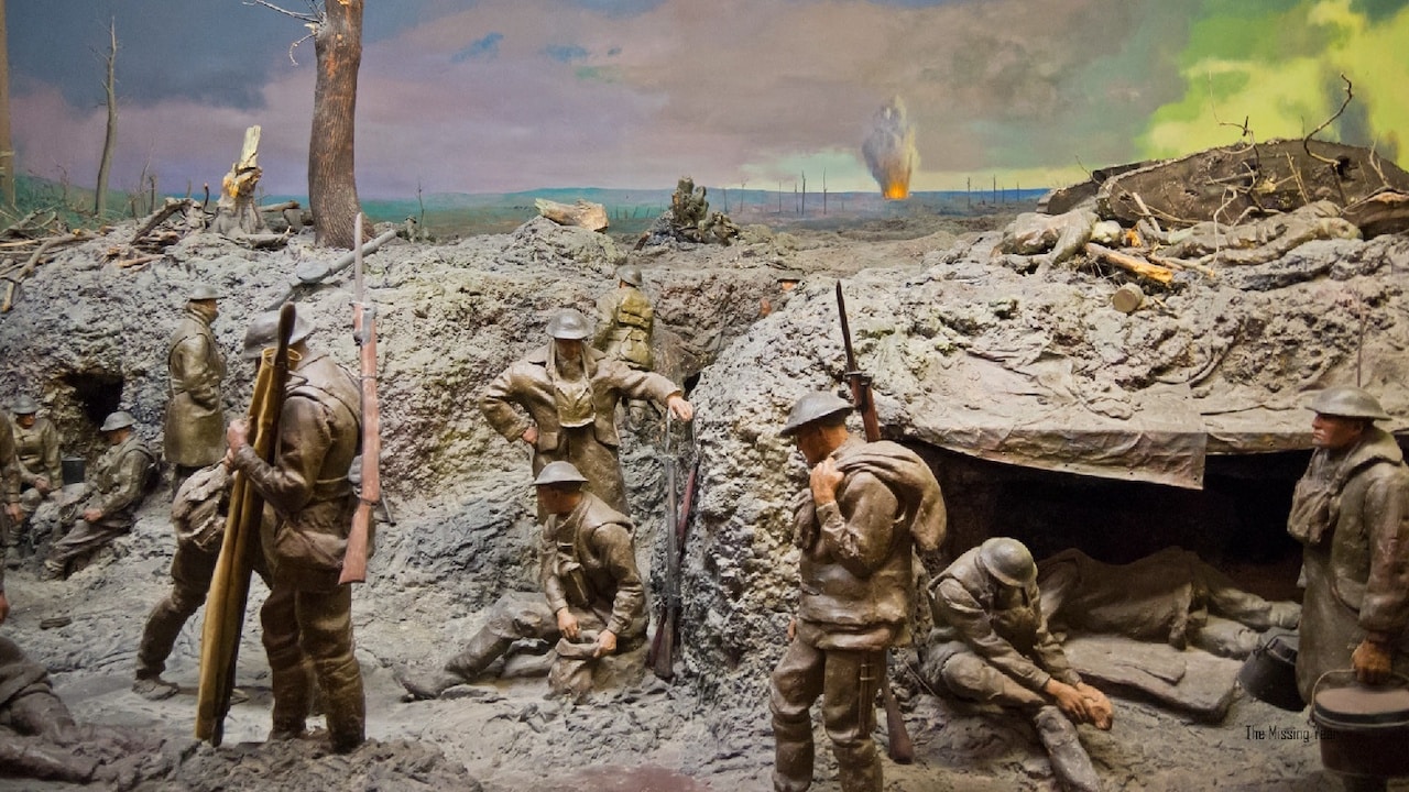
- Visit Physical Exhibits: Seeing a 1940s colour transparency projected or printed in a museum is a completely different experience than seeing it on a phone screen. The depth of field in large-format colour photography is something you have to see in person to truly appreciate.
History isn't a closed book. It's a living, breathing thing that changes every time we find a new box of slides in an attic. Looking at World War 2 photos in colour isn't about making the past look "cool." It's about making sure we never forget how real it was.